The Inflation Reduction Act (IRA) is being heralded by many in the movement as the most important U.S. climate legislation in, well, forever. The bill takes an innovative “carrot” approach to reducing greenhouse gas emissions by establishing a large set of tax and direct payment incentives whose purpose is to lower the cost of carbon-reducing activities. The bill’s 730 pages include an estimated 56 climate-related incentives and programs. A team of Georgia Tech experts explored the most important overall effects of the Inflation Reduction Act on GHG emissions reduction.
Estimating the Impacts of the Inflation Reduction Act on Greenhouse Gas Emissions
While no one knows for certain what effect these incentives will have on reducing U.S. greenhouse gas emissions, a preliminary analysis by the Princeton University REPEAT project concludes that by 2030, the bill will likely reduce national GHG emissions by about 42% compared to 2005 levels. Two additional independent studies by the Rhodium Group and Energy Innovation reached similar conclusions.
The U.S. has pledged to reduce GHG emissions below 50% of 2005 levels by 2030, so the bill, by itself, would fall short of the target. But it will likely bring the U.S. close enough that a variety of smaller measures could achieve enough additional emission reductions to allow the U.S. to reach the full 50% reduction target.
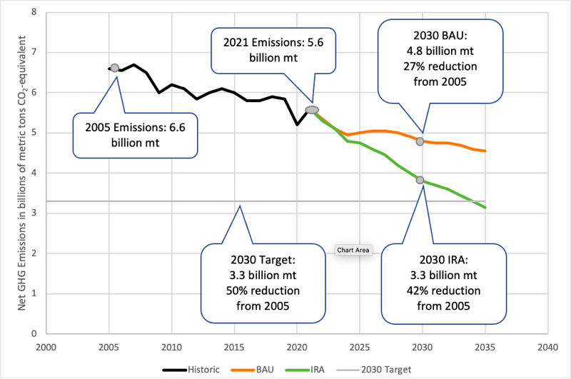
Figure 1: US Net GHG Emissions: Historic, Business as Usual, and Inflation Reduction Act
Source: Princeton REPEAT Project
Impacts on National GHG Emissions
Let’s start at the national level with the IRA analysis conducted by the Princeton REPEAT project. The chart in Figure 1 presents the core results.
The black line shows U.S. historic 2005-2021 net GHG emissions, which declined by 15% over the period. Net emissions are gross emissions from burning fossil fuels and other sources, minus CO2 removals from the atmosphere, largely by land sinks like forests.
The horizontal gray line is the target level of a 50% reduction from 2005.
The orange line shows projected greenhouse gas emissions based on modeling of a continuation of current policies, abbreviated in the chart as BAU or business as usual.
The green line is projected greenhouse gas emissions based on modeling of the effects of the IRA. It brings the U.S. near the 50% reduction target by 2030 and below the target by 2035.
Impacts on GHG Emissions in Georgia
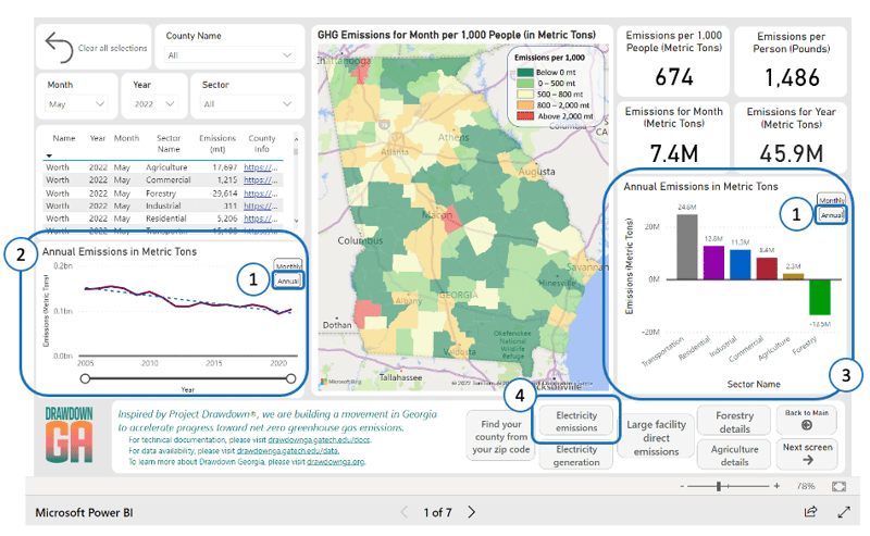 Figure 2: Annual emissions from the Drawdown Georgia GHG Emissions Tracker
So, what does this mean for emissions in Georgia?
To translate these national findings to Georgia and create a Georgia-specific version of Figure 1, we need (1) historic Georgia emissions; (2) a reasonable business-as-usual 2030 emissions projection for Georgia; and, (3) a method to translate Princeton’s IRA reduction estimates to Georgia.
Georgia Targets for 2030 Emissions
Historical emissions data for our state is available from the Drawdown Georgia GHG Emissions Tracker. As shown in Figure 2, clicking on one of the two Annual buttons (circled 1s) changes the Tracker from monthly data to annual. Focus on the Annual Emissions chart (circle 2). The dark red line is the Georgia equivalent of the black line in Figure 1. Move the mouse over any year in the Tracker chart (no need to click), and a popup will show that year’s net emissions. If you hover the mouse over 2005, you’ll see that net emissions in that year were 148.1 million metric tons. If Georgia cut emissions to 50% below 2005 levels by 2030, that would be 74 million metric tons, the Georgia equivalent to the gray horizontal line in Figure 1.
Georgia Business As Usual Emissions
Next, we need to establish a business as usual emissions projection for 2021-2030. This will turn out to be more complex, and more interesting than we might expect.
One simple way to project Georgia emissions is to take the Tracker’s Annual Emissions dashed trend line in Figure 2 and extend that trend line into the future. But if we use the mouse to popup 2021 emissions (103.2 million of metric tons, or mmt) and compare it to 2005 emissions (148.1 mmt), that’s a big, big decline of slightly more than 30%. And you may remember, over the same period national emissions declined by only 15%! Before we can extend the Georgia trend line, we’ll need to do some detective work to try and identify the cause(s) of the dramatic decline and determine if we could reasonably expect that decline to continue.
We’ll now use the Tracker to drill down and explore annual emissions by sector. In the sector bar chart (circle 3 in Figure 2) in the lower right of the Tracker, click on the gray Transportation vertical bar. Now look back to the Annual Emissions time series chart, which has changed to only show only transportation emissions. Those emissions are close to flat, or very slightly increasing. Click on each of the other sector bars and check out each sector’s overall trend. You’ll see that forestry and agriculture are close to flat, while residential, commercial, and industrial have all declined substantially. What do those sectors have in common? They all use lots of electricity.
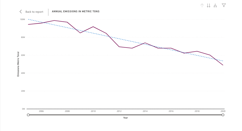 Figure 3: Annual electricity emissions from the Drawdown Georgia GHG Emissions Tracker
To further explore the electricity sector, push the gray “Electricity Emissions” button (circle 4 in Figure 2). Then click one of the two Annual buttons, and you will see an electricity emissions chart like the one shown in Figure 3. A quick look at the chart will reveal that 2005 electricity sector emissions were about 100 million metric tons, dropping to a little over 50 million metric tons in 2021, a decrease of nearly 50%. How could that happen?
A Closer Look at Emissions from Electricity in Georgia
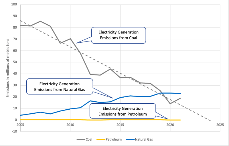
Figure 4: Georgia fossil fuel CO2 emissions from electricity generation
Source: Energy Information Administration data with calculations by Bill Drummond
We need to drill down yet further into electricity. Figure 4 shows that Georgia’s electricity (and overall) emissions have been declining because coal has been largely replaced by natural gas for electricity generation. Electricity generated from natural gas has about one-half of the GHG emissions of electricity generated from coal. With coal a dwindling portion of the state’s electricity mix, the pace of the emissions decline from 2005 to 2021 simply cannot continue. Figure 4 also shows a dotted line extending the trend in coal emissions into the future, and if that trend continues there will be little or no coal left for natural gas substitution as early as 2024.
For our Georgia “business as usual” scenario, instead of extending the overall trend of historic emissions, we will assume that the electricity decline will gradually slow to near zero while non-electricity trends in the other sectors will continue. We will also need to account for the two new Plant Vogtle nuclear reactors that are expected to enter service in 2023 and 2024. They will provide substantial zero-carbon electricity that will substitute for carbon-producing fossil fuel electricity. The results of these adjustments are shown as the orange BAU line in Figure 5.
Reducing Emissions in Georgia: What’s Possible by 2030
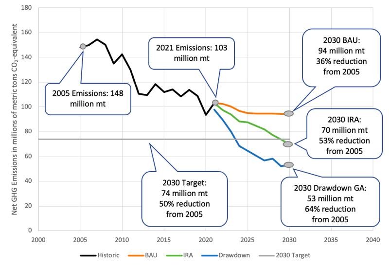
Figure 5: Georgia GHG Emissions: Historic, Business as Usual, IRA, and Drawdown Georgia
Source: Data from Energy Information Administration, Princeton REPEAT Project, and Drawdown Georgia; Calculations by Bill Drummond
Finally, we must transfer the Princeton national IRA emission reductions to Georgia. We’ll use a basic approach and simply calculate each year’s percentage reduction from the previous year’s emissions. Then we apply those same reductions to the Georgia business as usual scenario, resulting in Figure 5’s green line.
The big takeaway: if Georgia’s IRA emission reduction rates are similar to the national ones modeled by Princeton, by 2030 Georgia will have cut GHG emissions by more than 50% below 2005 levels.
The Inflation Reduction Act: Great News for Climate and Georgia
We have reached an important conclusion, but the process to get there may seem (even to me) somewhat abstract, wonkish, or even semi-magical. But to bring us back to earth, there is an additional blue line in Figure 5. In 2019, Drawdown Georgia conducted an extensive analysis of 20 specific on-the-ground climate solutions that are especially appropriate for Georgia. Those solutions could reduce state emissions by 46 million metric tons by 2030, and the blue line shows what, together, they could achieve. For a quick overview, see the interactive Carbon Reduction Visualizer. For the full story, see the peer-review paper published by the entire research team in the Proceedings of the National Academy of Sciences.
We have reached an important conclusion, but the process to get there may seem (even to me) somewhat abstract, wonkish, or even semi-magical. But to bring us back to earth, there is an additional blue line in Figure 5. In 2019, Drawdown Georgia conducted an extensive analysis of 20 specific on-the-ground climate solutions that are especially appropriate for Georgia. Those solutions could reduce state emissions by 46 million metric tons by 2030, and the blue line shows what, together, they could achieve. For a quick overview, see the interactive Carbon Reduction Visualizer. For the full story, see the peer-review paper published by the entire research team in the Proceedings of the National Academy of Sciences.
To summarize, the orange line in Figure 5 tracks where we were headed before the IRA bill, the green line shows what the bill’s incentives and programs could accomplish in Georgia, and the blue line reminds us that we have already identified more than enough Georgia-specific climate solutions to make those reductions actually happen.
This bill is great news for the climate, and great news for Georgia. And, as progress on the emissions targets progresses, we’ll be able to watch it all unfold through the Drawdown Georgia GHG Emissions Tracker.