
The Drawdown Georgia Emissions Tracker is reporting our progress toward net zero emissions for the state, making it possible to observe local action on carbon neutrality in close to real time.
The First Law of Holes and Climate Change
According to Wikipedia, the first law of holes states: “if you find yourself in a hole, stop digging.” If climate change is an immense hole, here’s a simple, straightforward program for action: (1) stop releasing greenhouse gasses and (2) stop cutting down trees. But in reality, we’re not going to be able to quit either of those activities quickly enough to limit the increasingly bad effects of a changing climate.

Instead, we appear to be gradually coalescing around a second-best approach known as net zero, or carbon neutrality. In 2021, the United States joined more than 70 countries in setting a net zero target for 2050. More than 20 states have set net zero or 100% clean energy goals. Hundreds of private companies, including Coca-Cola, UPS, and Amazon, have pledged to become net zero or carbon neutral by 2050.
What is net zero?
The Intergovernmental Panel on Climate Change (IPCC) explains that net zero is “… when anthropogenic emissions of greenhouse gasses to the atmosphere are balanced by anthropogenic removals.” It is this balancing of human-caused emissions with human-created removals that provides the extra flexibility for net zero, as opposed to forcing all GHG emissions to zero.
This flexibility, though, comes with a price. To achieve a goal of balancing emissions and removals, we must establish a set of accounts to track both emissions and removals. Traditionally this has been done through greenhouse gas inventories maintained at the global, national, state, local, or enterprise levels.
GHG inventories are lots of work. The draft 2021 U.S. national inventory report is 871 pages, not even counting the 574 pages of annexes! And by the time the national report is published, it will be more than two years out of date.
Tracking GHG Emissions in Georgia
That is why Drawdown Georgia hosts the Drawdown Georgia GHG Emissions Tracker. The goal is to provide greenhouse gas emissions estimates that are as timely as possible, as local as possible, and as accessible as possible.
Because local emissions data is not easily accessible, building the Tracker was no small feat. To reach our goal of providing smart, accessible, and timely information, we held a series of seminars with experts in each emission sector to gather intelligence that would help us design the optimal Tracker. At times, the experts didn’t agree amongst themselves, and at other times the experts conceded that the underlying issues were too complex to include a particular emissions subsector in the Tracker. We’ll discuss those below.
Net Zero on the GHG Emissions Tracker
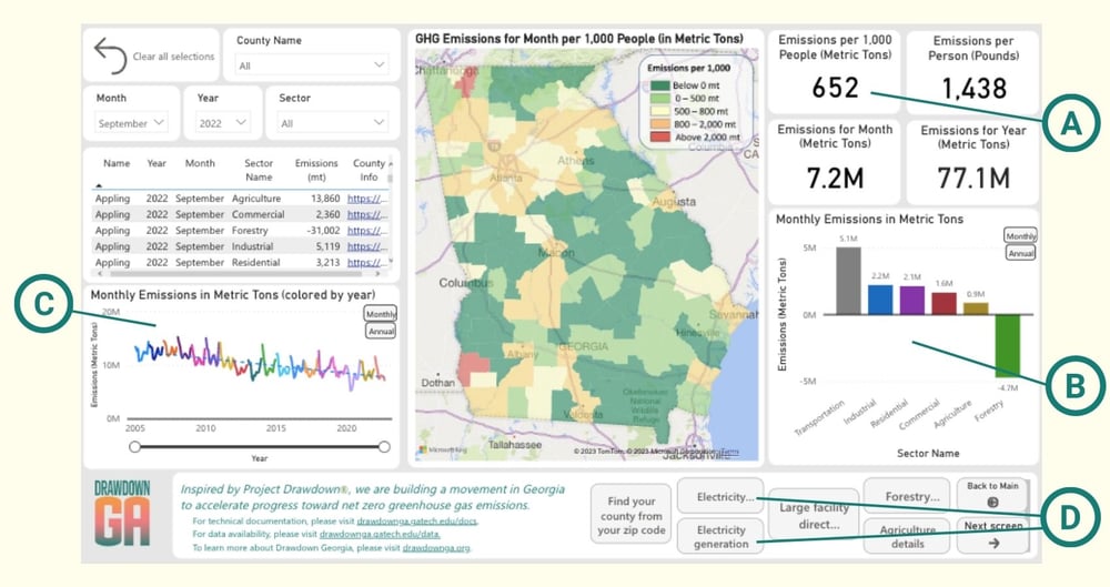 Figure 1: Drawdown Georgia GHG Emissions Tracker main screen
We can see net zero at two places on the Tracker dashboard as shown in Figure 1. Circle A points to the monthly net emissions per 1,000 persons for the most recent available month. When that number drops to zero (or below), emissions are at net zero (or below). The circle B bar chart shows the individual sector numbers that together add up to the overall number. Forestry sector emissions are negative, since trees pull CO2 out of the air and sequester it in their trunks, roots, and branches.
We’ll achieve net zero in Georgia when the sum of positive emissions in all the other sectors drops below the level of forestry CO2 removals. That is, however, a good distance in the future, as we can see in the circle C chart showing emissions over time. Statewide emissions have declined substantially since 2005, but not quickly enough to bring them to the net zero horizontal line by 2050.
The Tracker main dashboard shows statewide emissions. From the central map, you can click on an individual county to see the corresponding information for that county. In fact, the counties shown on the central map in dark green have achieved net zero emissions for the month. However, the below-zero emissions in those counties are more than counterbalanced by above-zero emissions in the other, more populous counties.
What about emissions from generating electricity in Georgia?
Most experts agree that zero-carbon electricity is the key to achieving net zero. But electricity isn’t even shown on the Tracker main dashboard. That’s because we’ve included it within the different residential, industrial, and commercial sectors, since there are different climate solutions for each of those sectors.
Electricity is shown on two separate Tracker dashboards, one for electricity emissions, and one for electricity generation. On the Drawdown Georgia GHG Emissions Tracker dashboard, you can click on one of the buttons at the bottom of the main screen (indicated by circle D above) to see the electricity data.
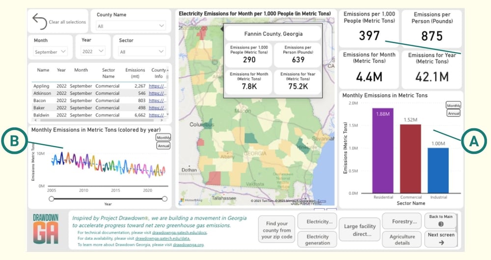 Figure 2: Electricity Emissions in Georgia
The Figure 2 bar chart for the three economic sectors shows that electricity consumption emissions are split roughly equally among the sectors (circle A) with approximately one million metric tons each. The trend chart (circle B) shows the dramatic decline of electricity emissions that has resulted from the increased use of natural gas power plants and the decreased use of coal-fired plants over time.
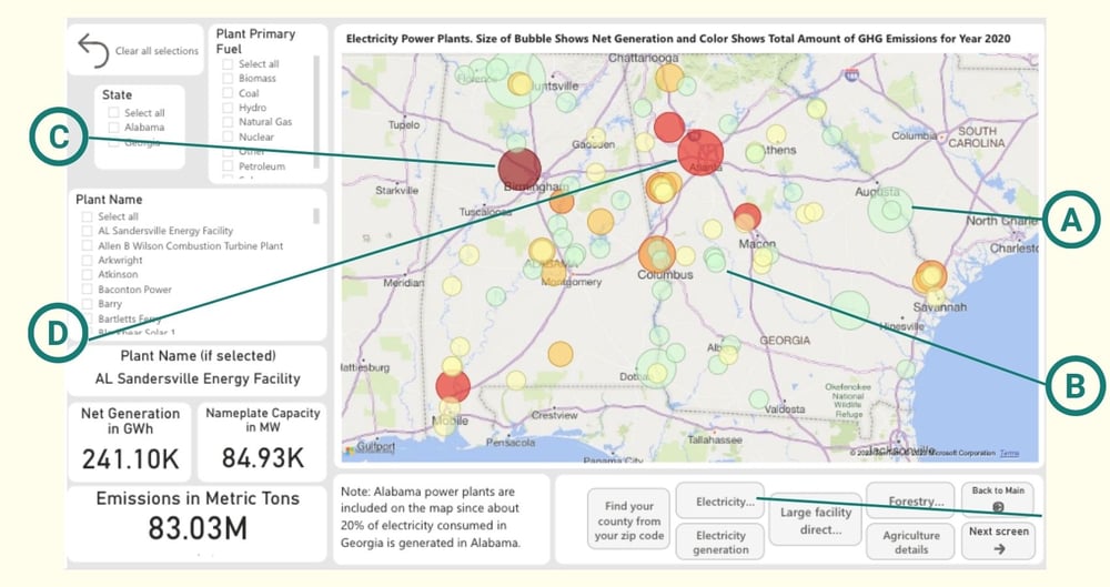 Figure 3: GHG Emissions from Generating Electricity
Figure 3 shows electricity generation data. The map shows individual electricity power plants in both Georgia and Alabama, because Georgia currently imports about 20% of its electricity from Alabama.
Once the two new Plant Vogtle nuclear reactors are generating electricity that import percentage will be reduced to about 10%.
On the map, the size of each bubble shows the amount of electricity generated, and the color intensity of the bubble indicates the level of GHGs released. The large light green bubbles (Circle A) are nuclear power plants and the smaller green ones (circle B) are solar farms. The largest dark red bubbles (Circle C) are very large coal plants, and the orange ones (circle D) are natural gas plants or coal plants operating at partial capacity.
Tracking electricity emissions by generation or consumption
The two electricity maps highlight two different ways of calculating emissions: by place of generation, or by place of consumption. Both are useful perspectives. When we focus on the place of generation, we can bring to bear supply-side climate solutions such as solar, wind, and nuclear-based electricity generation. When we focus on the place of consumption we can link to demand-side solutions such as increased energy efficiency and demand-reduction.
In the transportation sector, demand-side solutions include alternative transportation, such as increased walking, biking, and mass transit. On the supply side, electric and hybrid cars and trucks are primary solutions.
The Tracker, except for the electricity generation dashboard, focuses on consumption-side emissions. Electricity is counted in terms of the activities and locations at which it is consumed. Transportation emissions are located in the counties in which the gasoline and diesel fuel are actually burned. This is sometimes less than fair.
For example, a county may be traversed by a busy interstate highway carrying vehicles that began their trips far outside the county, and will conclude them at a second location, again far outside the county. If possible, it would be better to assign emissions to the location, person, or enterprise making the decisions that result in emissions. But for the transportation sector especially, we just don’t have that information.
What Emissions Aren’t Tracked by the Drawdown Georgia GHG Emissions Tracker?
Shortly after the Tracker was published in February 2022, the Environmental Protection Agency (EPA) released its first-ever set of state-level estimates for GHG emissions and removals. For most sectors and subsectors, the EPA estimates and Tracker estimates are within 10% of one another. This is not surprising since many of the same data sources were used for both.
However, the Tracker omits two sub-categories of emissions that the EPA includes: aviation fuel and substitution of ozone-depleting substances (SODS). Neither category is trivial: aviation fuel use totaled six million metric tons in 2020, and SODS was seven million metric tons when state gross emissions (not counting removals) came to 140 million metric tons. We excluded both categories due to our inability to determine a reasonable way to allocate them to individual counties.
Aviation fuel is particularly thorny, since a substantial percentage of aviation fuel consumed at the Atlanta airport serves travelers whose origins and destinations are out of state. SODS involves the recent generation of refrigerants that replaced freon to protect the planet’s ozone layer, but turned out to be very potent greenhouse gasses.
The Drawdown Georgia research team is continuing to study these two issues, and we hope to include both sub-categories in a future Tracker update.
What Else Does the GHG Emissions Tracker Report?
In comparing the EPA state results to the Tracker, we also discovered two categories of emissions the Tracker includes but the EPA excludes: electricity emissions imported from Alabama and a category called harvested wood products. First, the EPA only includes emissions for electricity generated in Georgia, ignoring the emissions for the electricity imported from Alabama. Our understanding is that there is no direct accounting for electricity moving across state boundaries. The Energy Information Agency does calculate net electricity imports and exports at the state level, but it conducts this calculation by subtracting state-level generation from state-level consumption, and allocating that number to imports or exports.
So for most of the U.S., it’s difficult or impossible to say where state-level imports come from or exports go to. But Georgia is an exception, since most of Georgia and Alabama lie within a single balancing authority administered by the Southern Company, the holding company for both Alabama Power and Georgia Power. This means that in Georgia we can know where our electricity imports originated and we can calculate the emissions involved in generating that electricity.
The second extra sub-category is listed in the EPA national GHG inventory as “harvested wood products.”
This category includes lumber used in building construction and the manufacture of furniture, paper, and related wood products. Some of the carbon in these products is sequestered for decades, and a significant portion is eventually buried in solid waste landfills where it is sequestered in the soil.
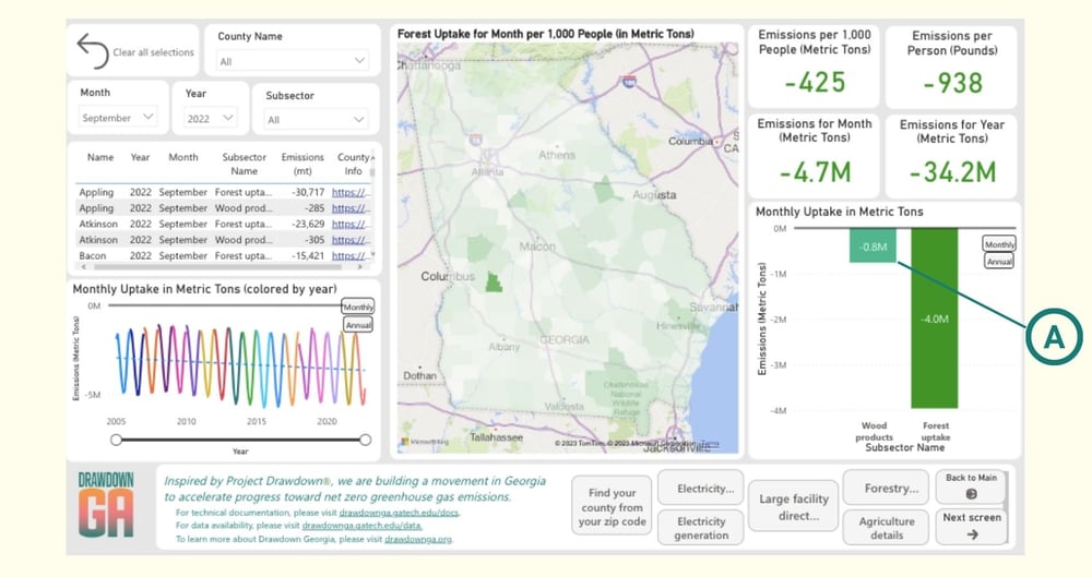 Figure 4
The EPA state inventories omit this category without explanation. The Tracker includes it, as seen in Figure 4’s circle A. We estimate the Georgia portion of the national amount by calculating Georgia’s percentage of national logging employment and multiplying that percentage times the national total for harvested wood products.
Despite these differences, the EPA’s Georgia estimates for most categories and sub-categories are within 10% of the Tracker values, and the overall totals, once adjusted for the omitted and extra categories, are within 5% of one another. The EPA state estimates are comprehensive and when summed should be very close to the national totals.
Tracking Georgia’s Path to Net Zero Emissions
In Georgia, we’re fortunate to have the Drawdown Georgia GHG Emissions Tracker. The Tracker values are somewhat less comprehensive, but more timely, more local, and more intuitive thanks to its tight integration of numbers, graphs, charts, and maps. Both are important and valuable tools in accelerating our progress toward net zero and a stable climate fit for humans.
Furthermore, the tracker continues to evolve into an ever more informative tool for tracking success on the state’s path to net zero emissions so we can all be part of the solution.