How can Georgia reduce its greenhouse gas emissions over the next decade? The Drawdown Georgia Research Team has laid out a vision. And, now, we have a way for you to explore the data with the Carbon Reduction Visualizer.
Modeling the Effect of High-Impact Solutions on Reducing Georgia's Carbon Emissions
Researchers from Georgia Tech, University of Georgia, Emory University, and Georgia State University identified 20 high-impact solutions that can cost-effectively reduce Georgia’s emissions by 2030. This includes solutions like reducing food waste, increasing solar generation, increasing energy-efficient cars and trucks, and investing in building retrofits.
The team then modeled what emissions reductions could look like if all 20 solutions scale to ambitious – but achievable – levels over the next ten years. Under these “achievable scenario” assumptions, the 20 high-impact solutions could cut emissions from 125 million metric tons (Mt) of carbon dioxide equivalent (CO2e) in 2020 to 79 Mt of CO2e in 2030 – which is well on the path to zero.
The Carbon Reduction Visualizer
We have created the Carbon Reduction Visualizer, an interactive graph to let you explore this data and to see how these emission reductions could add up.

How to Read the Climate Solutions Data in the Graph
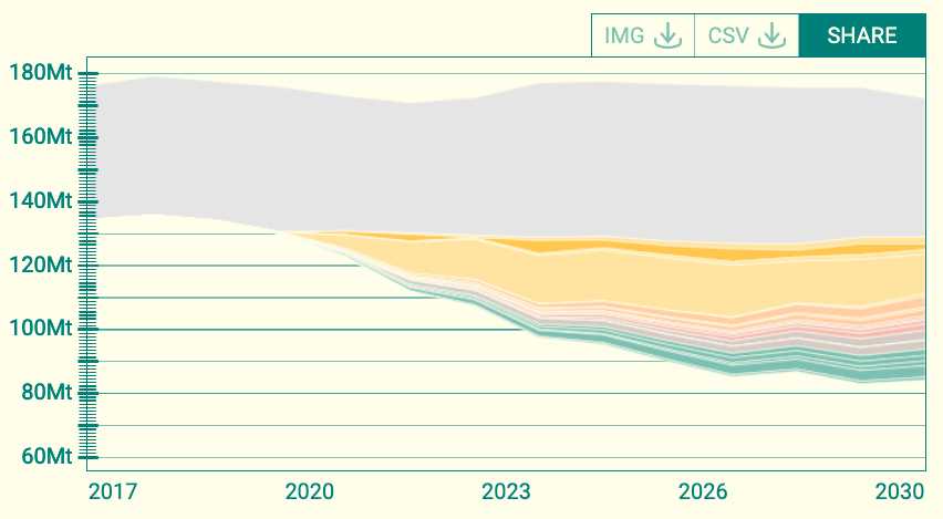
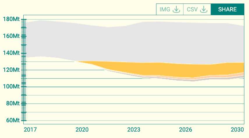
This wedge graph shows how each climate solution could contribute to CO2e emission reductions in Georgia over the next decade under two sets of assumptions: “baseline” and “achievable.” The baseline scenario projects what state-level emissions could look like if current trends continue. The achievable scenario assumes that each solution scales to ambitious, but achievable, levels by 2030.
The gray wedge at the top of the graph shows expected state emissions under the “baseline” assumptions from 2017 to 2030. The top of the gray wedge shows the projected total emissions. The bottom of the wedge shows projected net emissions, which reflect the role of natural carbon sinks. These land sinks, such as forests and coastal marshes, sequester carbon emissions and help to offset Georgia’s carbon footprint.
The colors below the gray wedge show the emissions reductions modeled in the achievable scenario. The height of each wedge corresponds to the amount of emissions reductions a particular solution could achieve in a given year under these assumptions. For example, the height of the large-scale solar wedge in 2030 is 11.2 Mt while the height of the recycling and waste management wedge reflects 3.1 Mt in 2030. All told, the 20 wedges represent 42 Mt of CO2e emission reductions in 2030.
Create Custom Carbon Reduction Projections
As with all modeling exercises, these graphs are not crystal balls and do not actually predict the future. Instead, they help us to understand what could happen under different assumptions -- how each solution could contribute.
So, what if the pathway to state-level emission reductions looks different than this?
The Carbon Reduction Visualizer allows users to make their own custom projections. You can build a unique wedge graph using the controls to the right of the graph, which allow you to set each individual solution to either its “baseline” or “achievable” emissions reduction levels. Doing so allows you to see the role that different solutions could play going forward. This will help visualize “what if” scenarios.
For example, what if we don’t compost more in the coming years or don’t drive cleaner cars? But, what if we do increase solar generation and reduce food waste? By toggling solutions between the two sets of assumptions, you can see how emission reductions might stack up.
More to Come for the Carbon Reduction Visualizer
The Drawdown Georgia Research Team will continue to refine the data that contributes to this graph over time.
For example, at this point, the Research Team has estimated the technical potential of each of the 20 solutions. This is the maximum emissions reduction any one solution could technically achieve in the state by 2030. But how would emissions fall if all organic waste in Georgia was composted? Or, how would emissions fall if all south-facing roofs in the state had solar panels? This information may be added to the graph in the coming months.
In addition, we know that many of these solutions are interrelated. However, for the most part, the solutions are currently modeled independently. There are a few key exceptions. Electric vehicles, rooftop solar, and retrofitting were modeled to reflect the amount of large-scale solar that we assume is deployed going forward. The emissions associated with these three solutions vary depending on whether large-scale solar is assumed to continue at baseline levels or to increase in the achievable scenario. Additional interactions may be added over time, so stay tuned for new features and updates to our data.
Try out the Carbon Reduction Visualizer for yourself now!
We hope you enjoy using this unique interactive tool to explore the data behind Drawdown Georgia’s 20 solutions.